

Earthy Browns & Warm Neutrals Take Center Stage

Grays and stark whites are fading into the background. In their place? Rich, warm browns—think camel, caramel, honey, and clay. These tones create a sense of grounding and comfort that today’s buyers connect with on an emotional level.
To reflect this trend, many brands are transitioning their lifestyle scenes to incorporate natural materials like wood, rattan, and stone—paired with soft, muted walls in cinnamon or terracotta. In digital templates and CMS environments, switching to a clay or tan base can help modernize your content without changing the core layout.
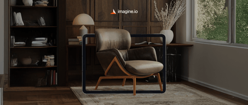
Using platforms like imagine.io, visual teams can now test these shifts quickly—adjusting background tones, prop colors, or fabric textures in just a few clicks. It’s an easy way to keep your visuals aligned with evolving buyer preferences.
Deep Blues & Jewel Tones Add Drama and Depth

There’s something undeniably powerful about jewel tones. Whether it’s sapphire blue, emerald green, or rich amethyst, these colors bring confidence and sophistication to a room—and to your product visuals.
Accent walls in deep blue or teal can immediately elevate a scene, especially when paired with metallics, marbles, or richly grained woods. Upholstery and cabinetry in these hues work best when styled with clean lines and balanced lighting to avoid overpowering the space.
In digital styling, tools like imagine.io make it simple to test different jewel-toned backdrops or materials without committing to a reshoot—letting you fine-tune the mood before finalizing assets for your catalog or website.
Reds and Plums Are Quietly Making a Comeback

While not as bold as bright primary reds, the more grounded tones—think oxblood, aubergine, and terracotta—are making subtle but impactful returns. These colors feel heritage-rich and emotionally grounded, offering a sense of history and intimacy.
You might start seeing them in soft furnishings like velvet ottomans, handwoven throws, or statement wall colors in smaller spaces. They’re also excellent for seasonal visual refreshes—adding warmth without overwhelming the overall palette.
Digitally, these tones can be layered into lifestyle scenes through textiles, wall color swaps, or accent décor. And with imagine.io’s digital scene builder, making those updates is simple and scalable.
Black is the New Luxury Neutral

Used sparingly and strategically, black adds weight and polish. It anchors lighter palettes, frames key products, and gives a modern edge to any scene. Matte black finishes in particular—on lighting fixtures, table bases, or hardware—create sleek, high-contrast moments that feel intentional and premium.
What’s important here is balance. A black sideboard might ground a space, but pairing it with warm woods or creamy fabrics keeps the room from feeling cold. That’s the visual sweet spot.
By using tools that let you toggle finishes and accent pieces digitally, your team can quickly find the right mix of warmth and contrast that aligns with both product positioning and current trends.
Playful Pastels & Bright Pops Are Here—But in Small Doses
After the hyper-saturated “Barbiecore” moment, 2025 brings a softer, more nuanced take on color. Bubblegum pink, lemon yellow, mint green, and lilac are showing up in accent items—think chairs, planters, or wall art.
These pastel elements inject lightness and optimism into interiors, but they’re most effective when used sparingly. The key is to integrate them as small highlights that catch the eye without dominating the frame.
In visual content, this might mean layering a pastel pillow into an otherwise neutral room, or showcasing a playful lamp as a conversation starter. Platforms like imagine.io make these additions quick to test—and easy to remove if needed—helping teams gauge what resonates best with different audiences.
Let’s Talk Texture: Material Trends That Are Reshaping Visuals

Color is just part of the equation. Texture tells a deeper story—one of touch, comfort, craftsmanship, and quality. And in an increasingly digital marketplace, simulating tactile experience through visuals is more important than ever. Here’s what’s rising in 2025:
-
Natural & Sustainable Materials Lead the Way
Reclaimed wood, cork, bamboo, and rattan aren’t just eco-conscious choices—they’re also visually compelling. These materials bring warmth, character, and authenticity to scenes.
Brands are using close-up product shots to highlight grain, weave, and imperfection—helping customers connect with the material story before they ever see the piece in person. In digital content creation, these textures can be layered in or swapped out easily using platforms like imagine.io.
-
Soft, Tactile Textiles Are Still Going Strong
Bouclé remains a favorite, but it’s evolving in color and structure. Meanwhile, velvet, sherpa, heavy linen, and chunky knits are being layered into scenes to increase perceived comfort and softness.
These materials shine in lifestyle visuals. A velvet sofa paired with a stone coffee table? That's the contrast that sells. Texture-rich visuals like these hold attention longer—and drive stronger emotional responses.
-
Stone, Marble & Dramatic Surfaces Are Eye-Catching Anchors
Highly veined marbles and bold slabs are making a statement, especially in kitchens and bathrooms. These materials are being styled as centerpieces, often doubling as functional surfaces and visual art.
Think statement kitchen islands, stylized bathroom vanities, or coffee tables with sculptural appeal. These are best showcased in hero shots or zoomed-in angles that bring the natural pattern to life.
-
Glossy Finishes Are Back—When Done Right
High-gloss lacquer and polished surfaces are returning in small doses, particularly in cabinetry and furniture bases. The trick is contrast—pairing gloss with matte or textured elements to avoid visual overload.
This works beautifully in editorial-style visuals where light reflection becomes part of the aesthetic. With digital render tools, lighting and finish can be adjusted to get the desired sheen without creating glare.
-
Mixed Metals Add Visual Richness
Forget matching finishes. Brass, copper, matte black, and chrome are being layered together in ways that feel curated, not chaotic. The result is dimensionality—luxury without flashiness.
A copper lamp next to a brushed brass table leg? That’s where visual interest comes alive. These combinations perform well in close-up styling and zoomable interactive visuals.
-
Handcrafted Elements Tell a Story
In a world full of mass production, handcrafted pieces—ceramics, carved woods, woven rugs—bring individuality and soul. These details matter. They tell buyers this isn’t just a product—it’s a piece with a story.
Visually, these are perfect for close-ups and detail shots. A hand-formed ceramic bowl with slight irregularities or a rough-edged wooden tray gives your visual content texture and authenticity buyers notice.
How imagine.io Helps You Keep Pace—Without Reinventing the Wheel
Aligning your visuals with fast-changing design trends doesn’t mean you need to rebuild your entire content system. With imagine.io, your team can:
- Instantly rotate between trending color swatches or material finishes on high-fidelity visuals
- Digitally swap props, accents, and backgrounds to match evolving aesthetics
- Showcase different colorways or seasonal scenes across product SKUs
- Preview and optimize imagery across eCommerce, catalogs, and social campaigns—before publishing
This flexibility helps creative, merchandising, and marketing teams move faster—without compromising visual quality or brand consistency.
Conclusion: Design Trends Drive Decisions—Visuals Seal the Deal
In 2025, color and material choices are doing more than shaping style—they’re shaping buying behavior. When you align your product visuals with what customers care about—comfort, authenticity, sustainability—you’re not just keeping up. You’re leading. And as trends continue to evolve, having the ability to adapt your visual content quickly and strategically is what sets modern teams apart.
With imagine.io, you get the creative freedom and production efficiency to bring these trends to life—at scale and with impact. So, book a demo today and let’s explore how you can translate trend insights into compelling, on-brand visuals—without the production bottlenecks.
.gif?width=1296&height=1296&name=Untitled%20design%20(8).gif)
Book a demo with our experts


.png?width=500&name=How%20to%20Add%20a%203D%20Product%20Configurator%20to%20Your%20WordPress%20Website%20(Complete%20B2B%20Guide).png)


%20(1).png?width=500&name=Why%20Exploded%20Mattress%20Views%20Matter%20(And%20How%20to%20Generate%20Them)%20(1).png)
.png?width=500&name=Best%20Shopify%20Product%20Configurator_%20How%20to%20Choose%20the%20Right%20One%20(2).png)
.png?width=500&name=Why%20Exploded%20Mattress%20Views%20Matter%20(And%20How%20to%20Generate%20Them).png)


.png?width=500&name=Best%20Shopify%20Product%20Configurator_%20How%20to%20Choose%20the%20Right%20One%20(1).png)


.png?width=500&name=How%203D%20Rendering%20Can%20Make%20or%20Break%20Your%20Industrial%20Design%20Pitch%20(1).png)


%20with%20Digital%20Twins%20and%203D%20Visualization.png?width=500&name=Optimizing%20Your%20Digital%20Asset%20Management%20(DAM)%20with%20Digital%20Twins%20and%203D%20Visualization.png)


