

Why Color of the Year moments matter for product visuals?
Trend signals like Pantone’s Color of the Year are not limited to inspiration boards. They influence campaign creative, seasonal storytelling, and how brands refresh their visual language without changing the product itself.
At the same time, brands are under pressure to produce more content than ever. Ecommerce pages, marketplaces, social campaigns, email, sales decks, and retail presentations all require visuals that feel consistent yet adaptable.
This creates a practical challenge. How do you respond to evolving creative directions without rebuilding sets or reshooting products?
That question shaped our Cloud Dancer study.

The creative question we wanted to answer
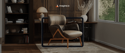
Instead of building full lifestyle scenes or styled interiors, we intentionally limited the setup.
One product
One pedestal
One neutral foundation
The goal was simple. Could a single product feel editorial, commercial, calm, dramatic, or minimal simply by adjusting lighting, palette, and composition?
And more importantly, could this approach translate into a repeatable workflow for brands?

A visual study: One product, multiple moods
Using Cloud Dancer as the base environment, we created a series of scenes built entirely around subtle shifts in light and color.
In some scenes, the product appears almost weightless. Soft, diffused lighting creates an airy and atmospheric feel. These visuals work well for brand storytelling, hero imagery, and launch moments where emotion leads and detail follows.
In others, the setup becomes more grounded and studio-focused. Clean surfaces, even lighting, and minimal contrast put the product front and center. This approach is especially effective for ecommerce, where clarity and accuracy matter most.
We also explored how small changes can dramatically alter perception. Directional lighting introduced contrast and shadow, making the same product feel more sculptural and gallery-like. Cooler tones shifted the mood again, creating a quieter and more restrained energy that suits seasonal or wellness-oriented storytelling.


Across every scene, the product itself never changed. Only the environment did.
That consistency is the real takeaway.
What this reveals about modern product visuals?
This study reflects a reality many brands face today.
Traditional photography makes variation expensive. Each new look often requires new sets, new lighting setups, extended timelines, and added cost. Even small changes can introduce friction.
Working from a single 3D product model changes that equation. Lighting, materials, backgrounds, and composition become creative variables rather than production constraints.
This shift is less about aesthetics and more about control.
How imagine.io supports this way of working
Imagine.io is built on the idea that one accurate 3D product can unlock a wide range of visual outputs.
Teams use the platform to:
- Build simple or editorial scenes without physical sets
- Experiment with lighting and mood quickly
- Generate consistent visuals for PDPs, campaigns, and sales assets
- Adapt content for different channels without reshooting products
In this context, Cloud Dancer becomes a useful metaphor. A neutral foundation that allows creativity to scale without sacrificing consistency.

Why neutrals like Pantone's Cloud Dancer work so well?
There is a reason we leaned into a soft neutral rather than a bold or saturated color.
Neutrals:
- Work across categories like furniture, decor, textiles, and appliances
- Keep the product as the focal point
- Adapt easily to different brand identities
- Remain relevant beyond a single campaign cycle
In many ways, Cloud Dancer mirrors our approach to product visuals. Calm foundations that give brands room to create, test, and evolve.
One product does not need one look.
This project began as a creative exploration of Pantone’s Cloud Dancer, but it leads to a broader insight.
Brands do not need more photoshoots to create more content. They need better systems.
With a strong 3D foundation, one product can support many moods, channels, and moments. Lighting, color, and composition become tools for storytelling rather than barriers to scale.
That is how modern product visuals stay flexible, consistent, and ready for what comes next.
If you are exploring how to build that kind of system for your own collections, imagine.io makes it possible to start with one product and go far beyond one look.
.gif?width=1296&height=1296&name=Untitled%20design%20(8).gif)
Activate Your Free Trial


.png?width=500&name=How%20to%20Add%20a%203D%20Product%20Configurator%20to%20Your%20WordPress%20Website%20(Complete%20B2B%20Guide).png)


%20(1).png?width=500&name=Why%20Exploded%20Mattress%20Views%20Matter%20(And%20How%20to%20Generate%20Them)%20(1).png)
.png?width=500&name=Best%20Shopify%20Product%20Configurator_%20How%20to%20Choose%20the%20Right%20One%20(2).png)
.png?width=500&name=Why%20Exploded%20Mattress%20Views%20Matter%20(And%20How%20to%20Generate%20Them).png)


.png?width=500&name=Best%20Shopify%20Product%20Configurator_%20How%20to%20Choose%20the%20Right%20One%20(1).png)


.png?width=500&name=How%203D%20Rendering%20Can%20Make%20or%20Break%20Your%20Industrial%20Design%20Pitch%20(1).png)


%20with%20Digital%20Twins%20and%203D%20Visualization.png?width=500&name=Optimizing%20Your%20Digital%20Asset%20Management%20(DAM)%20with%20Digital%20Twins%20and%203D%20Visualization.png)


